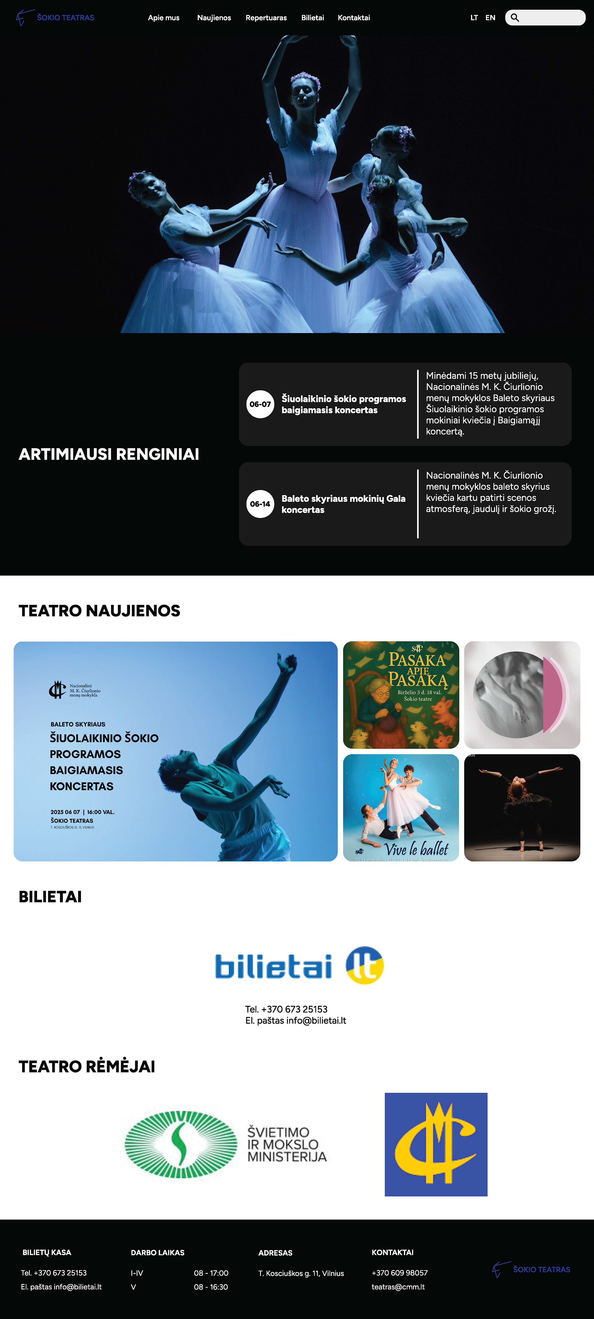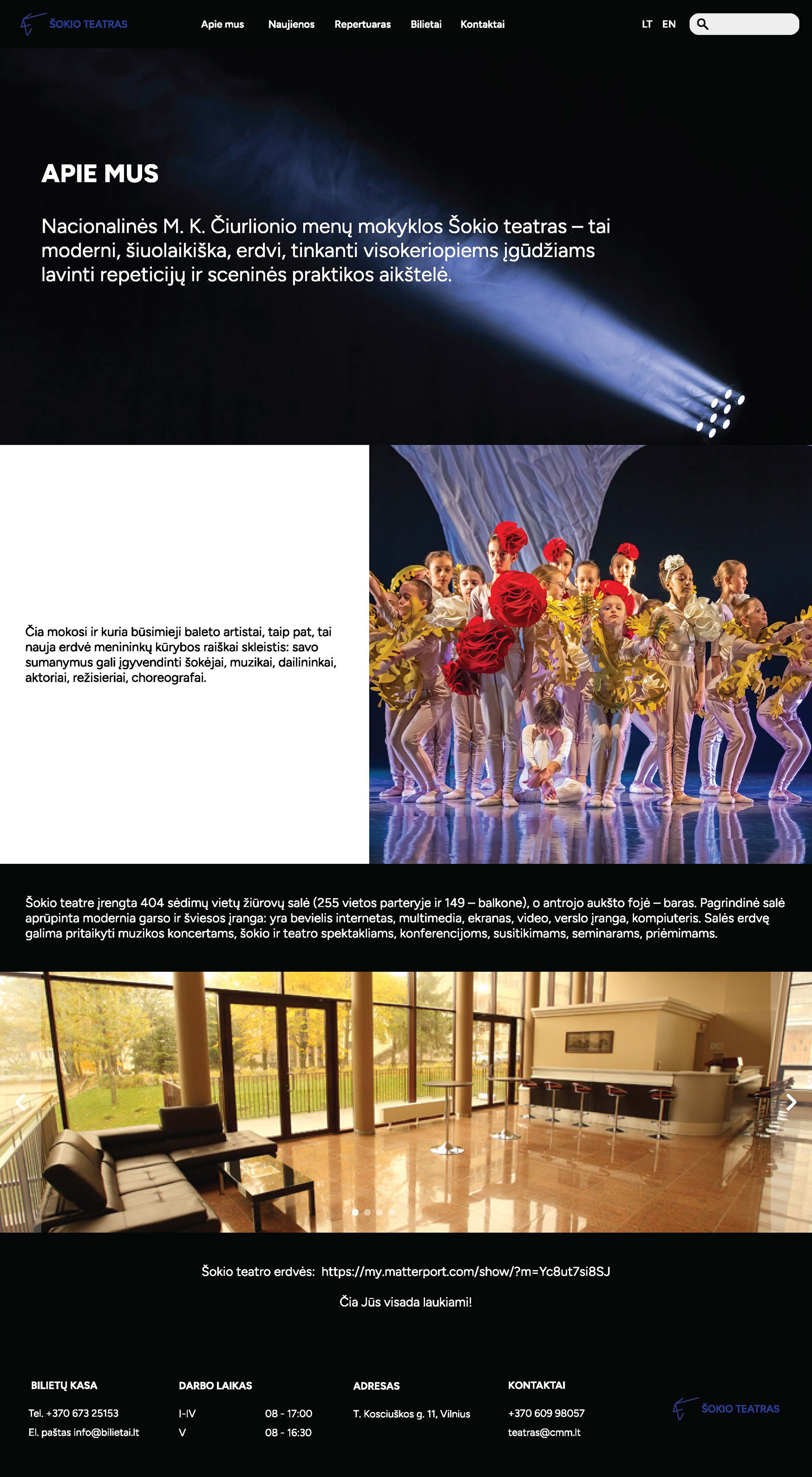
The new design introduces a cleaner interface, improved content hierarchy, and simplified navigation that allows visitors to access important sections more efficiently. Event information was reorganized into clearer cards and sections, making performances and schedules easier to browse. The homepage structure was redesigned to highlight upcoming events, theatre news, and ticket access in a more visually engaging and user-friendly way.
The redesign process began with competitor and market analysis, client research, UX personas, sitemap creation, and user flow planning to better understand audience needs and identify usability issues within the original website. One of the main problems discovered was difficult navigation - users struggled to quickly find event information, tickets, news, and contact details due to cluttered structure and outdated layout organization.
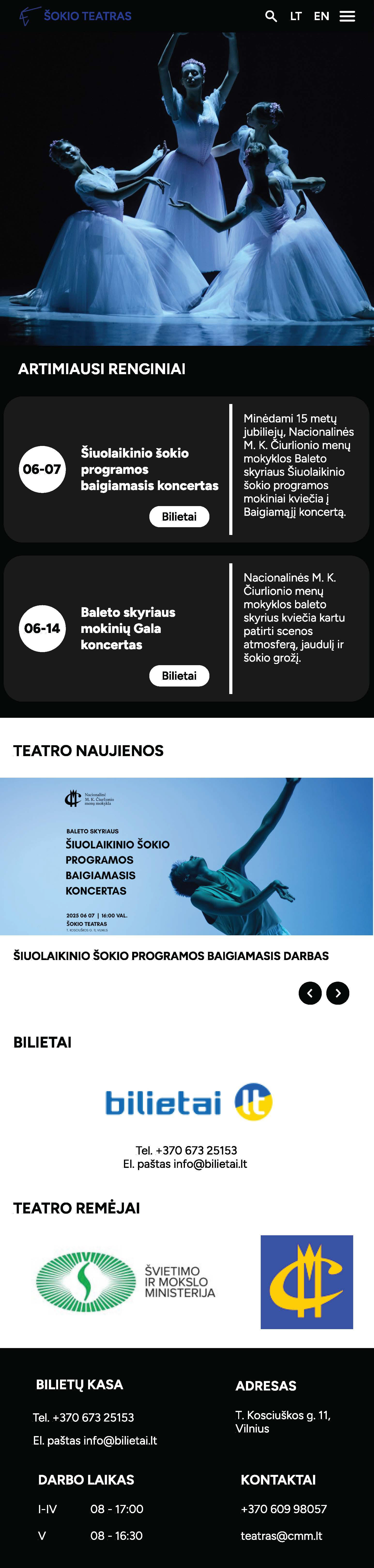
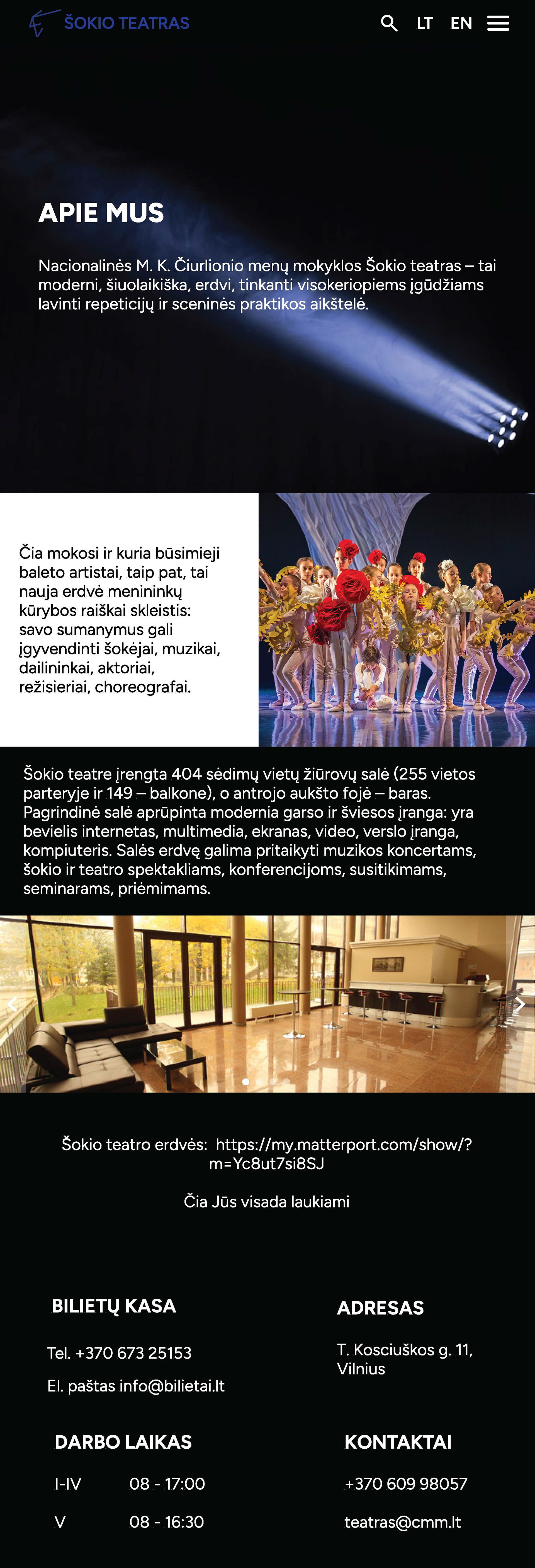
A responsive mobile version was also designed to ensure smooth usability across different screen sizes. The mobile interface features optimized layouts, accessible navigation menus, improved readability, and touch-friendly interactions, creating a seamless browsing experience for users on smartphones and tablets.
The visual direction combines dark backgrounds, strong typography, and large performance imagery to reflect the atmosphere of contemporary dance and theatre performances while maintaining a modern and professional aesthetic.
The final result delivers a more accessible, visually cohesive, and user-centered digital experience that improves navigation, content discovery, and overall interaction with the theatre’s online platform.
Back to Top